If you’re creating a logo for your company, there are several questions you should ask yourself to come up with a unique symbol for your brand. Answer these first before you hire a custom label printing firm.
1. What kinds of logos can I choose from?
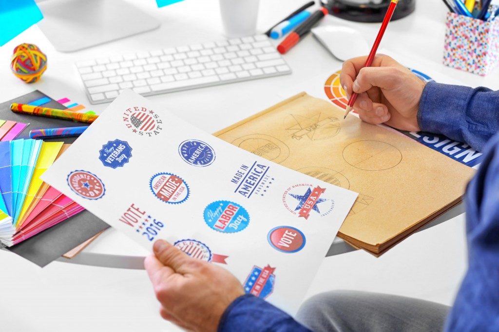
- Abstract – This kind of logo doesn’t represent anything recognizable, like numbers or words. It’s very unique and easily identifiable if the brand succeeds in becoming popular. The perfect example of an abstract logo is that of Mercedes Benz.
- Letterform – This represents the brand with a single letter. Examples are McDonald’s, Uber, and Honda.
- Pictorial – This logo type exhibits images that are recognizable but unique to the brands they represent. The mermaid in the Starbucks logo is a perfect example. Mermaids have long been part of Greek mythology and other folklore, but Starbucks was able to make their mermaid unique.
- Wordmark – This kind of logo has freestanding words that represent the company or the brand. Think of Google, eBay, Yahoo, and YouTube.
2. What logo will suit my brand?
It really depends on you. There’s no manual or guide that can tell you what logo to choose for any brand. You just need to make your logo unique represent what your business is all about.
3. What should my logo express about my business?
Your logo is representative of your brand and your brand is representative of your business, so your logo should display what your business is all about. Take a look at McDonald’s logo: it’s a huge letter ‘M’ in yellow font with a red background. It tells you that it’s a business built to make people happy, which is why they chose bright colours for their logo.
You need to think what values your business represents the most. If you’re aiming for elegance, you should come up with a logo that embodies that. Straight lines and bold fonts embody elegance and efficiency, so perhaps you can start with that.

4. What colours should I use?
If you’re creating your logo, it’s important not to take anything for granted, especially the colours of your symbol. Some people think that any colour will do, but before you splash your logo with red ink, think first about the values of your brand.
If your brand’s values depict fierce competitiveness, for example, then you might want to use red as your colour. Red exudes vitality, urgency, and even aggressiveness.
Notice that whenever a store displays a ‘sale’ sign, it’s always in red. That’s because red is the most visible colour in the spectrum. It’s easy to spot from a distance and it somehow speaks to our subconscious that we need to pay attention to it right away.
5. What kind of font should I use?
The type of font you’re going to use will also depend on the kind of business you have. If you’re selling running shoes, your font should evoke a feeling of swiftness. So, you might want to use straight lines in a slanted position in order to imply that the texts are in motion.
These are just some of the questions you need to ask yourself if you’re thinking about creating your own logo. Try using these tips in your brainstorming session and you’ll be able to come up with a unique logo ready to be printed.